Public Page Customization
Customization controls both how the page looks and how it behaves for readers.
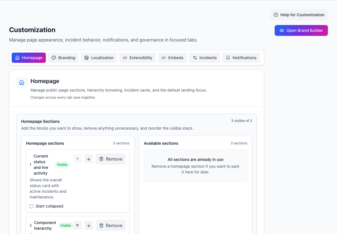
- Customization areasSwitch between homepage, branding, localization, embeds, and behavior settings.
- Homepage sectionsControls which public-page sections are visible and in what order.
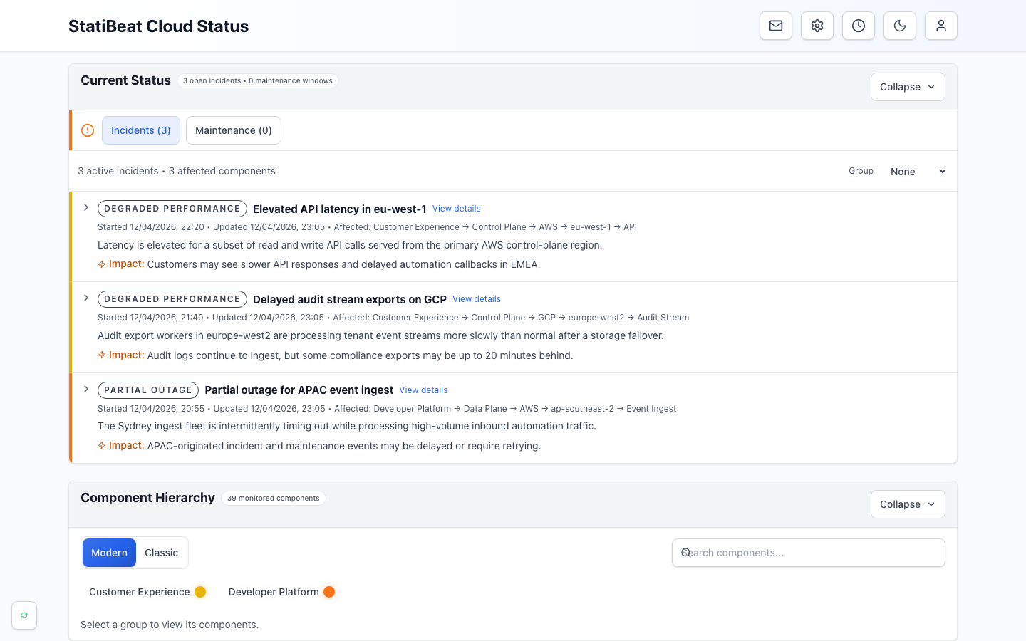
- Current statusSummarizes open incidents and maintenance at the top of the page.
- Active incidentsExplains customer impact, affected services, and the latest update.
- Component hierarchyLets readers browse the health of the products and services they use.
The main customization areas
The current customization workspace is split into:
HomepageBrandingLocalizationExtensibilityEmbedsIncidentsNotifications
Homepage layout
The homepage configuration decides which sections visitors see first.
The main sections are:
- current status and live activity
- component hierarchy
- previous activity
Admins can:
- reorder sections
- hide sections
- choose the default hierarchy mode
- set a default component focus
Basic View vs Tree View
This is one of the most important visitor-facing choices.
Choose Tree View when you want:
- a concise structural tree
- a clear sense of parent-child depth
- a classic service hierarchy feel
Choose Basic View when you want:
- flatter expandable rows
- more progressive disclosure
- a layout that feels easier to browse for less technical audiences
Branding
Branding includes:
- site title
- site subtitle
- header identity mode:
Logo + Text,Logo Only, orText Only - managed uploads or approved URLs for light and dark logos
- managed favicon upload or approved favicon URL
- light and dark brand colors
- separate page and header background images
- body and heading font presets, or managed WOFF2 font uploads
- split, stacked, or centered header composition
- icon, mixed, or labeled header actions
- header links, footer text, and footer links
- Brand Builder with guided starter styles, live previews, and visual rollback
The goal is not only to look polished, but to make the page feel trustworthy and familiar.
Uploaded background and font files are tenant-owned, content-addressed, and served from the status page origin. Header and footer links are declarative: use an HTTPS destination or a safe site-relative path. Arbitrary header HTML is not supported.
Brand Builder: the no-CSS path
Choose Open Brand Builder from Customization when you want the status page to share the visual language of your product, documentation, support portal, or main website.
Start with one of these visual directions:
StatiBeat defaultpreserves the existing platform presentationModern productuses crisp surfaces, rounded corners, and restrained elevationEditorialuses a calmer, content-led layoutMinimalis narrow, flat, and deliberately quietHeritageuses warmer surfaces and firmer borders
The starter style is only a foundation. Guided controls let you change:
- light canvas and panel colours
- automatic or custom dark surfaces
- content width and spacing density
- corner shape and depth
- header tone and image scrim
- section-heading and status-label treatment
- page and header composition, typography, and brand accents
Use Reset colours or Reset presentation to return one group to the closest starter style without discarding the rest of the draft. Reset all returns to the unchanged StatiBeat presentation.
StatiBeat generates the remaining palette, including readable body text, muted text, links, controls, focus treatments, and status presentation. It checks normal-text contrast in both colour modes and harmonizes incompatible canvas and panel choices before rendering them.
The editing model is draft-based:
- Changes stay local inside Brand Builder.
- Cancel discards the draft.
- Open full-page preview creates a short-lived page-scoped preview against real page data.
- Publish updates only the allow-listed visual settings.
- The Published versions panel restores the complete appearance, including guided settings, managed identity, navigation, typography, and advanced CSS.
The full-page preview bypasses the public settings cache, is clearly marked as temporary, and returns an unavailable message after its token expires. Preview tokens and revisions are scoped to one status page. Managed preview assets must belong to that page. Restoring a version still follows current plan limits and Terraform settings locks.
Terraform exports include the complete guided profile as the typed public_theme_profile setting. This keeps Terraform-managed pages visually reproducible without converting the generated theme into custom CSS.
Localization and Extensibility
Use Localization for the hosted document language and public date/time formatting locale.
Use Extensibility for bounded custom CSS on hosted public routes after Brand Builder. Custom CSS is the advanced escape hatch for unusual visual identity and composition. Product behavior, status data, incident workflows, and navigation semantics remain owned by StatiBeat.
The boundary is deliberate:
- CSS is page-scoped, bounded, parsed, and validated
- third-party resource loading is blocked
- uploaded visual assets use managed controls instead of CSS URLs
- HTML and JavaScript injection are not supported
- required controls are protected at validation time and checked again in the browser
Custom CSS API
Use the Customization → Extensibility tab when Brand Builder cannot express a visual requirement. The editor is an advanced setting because custom CSS can change the page's visual hierarchy and contrast.
Custom CSS is a presentation layer. It can change typography, colors, spacing, layout, cards, status indicators, responsive behavior, and decorative effects. It cannot add page data, change incident behavior, or run JavaScript.
Scope and limits
- Every selector must target
.sb-pageor[data-sb-page]. - CSS only applies to the hosted public status-page surface, not admin routes.
- Stylesheets are limited to 16,000 characters, 250 rules, and 2,000 declarations.
@media,@supports,@container,@layer, and keyframe animations are supported.- Style tags, imports, external URLs,
@font-face, JavaScript URLs, and CSS expressions are rejected. - Keep important status and incident content visible and accessible at all viewport sizes.
- Styles saved before the scoped CSS API may remain visible in the editor, but legacy unscoped styles are not rendered until their selectors are updated.
Brand Builder preview
Choose Open Brand Builder from Customization. It renders unsaved guided settings, managed identity settings, and custom CSS without publishing them.
Use its controls to check:
- desktop, tablet, and mobile widths
- homepage, incident-detail, and access-gate surfaces
- populated, loading, empty, and error states
- light and dark color schemes
Advanced CSS is collapsed by default. Its editor updates the preview immediately and explains rejected rules. Unsafe or incomplete CSS is withheld from the preview. If CSS overrides a guided token, Brand Builder reports the overlap and offers a switch to hide advanced CSS temporarily. The preview runs in an isolated iframe whose viewport really changes at each selected width, so normal CSS media queries behave as they do on the public page. It stays inside the public .sb-page contract, so tenant CSS cannot style the surrounding admin interface.
Supported hooks
Use these stable hooks instead of internal utility classes:
| Hook | Purpose |
|---|---|
.sb-page, [data-sb-page] | Hosted page root and required scope |
.sb-header, [data-sb-region="header"] | Page header |
[data-sb-section="current_status"] | Current status and active activity |
[data-sb-section="hierarchy"] | Component hierarchy |
[data-sb-section="previous_activity"] | Previous incidents and maintenance |
[data-sb-component="active-incidents"] | Active incident list |
[data-sb-component="active-maintenance"] | Active or upcoming maintenance list |
[data-sb-item="incident"] | An incident item |
[data-sb-item="maintenance"] | A maintenance item |
[data-sb-status="..."] | Current status value on a page, incident, or maintenance item |
[data-sb-region="detail-body"] | Incident, maintenance, and service detail content |
[data-sb-region="page-state"] | Loading, empty, and error states |
[data-sb-region="access-form"] | Protected-page access flows |
[data-sb-region="footer"] | Public footer |
[data-sb-element="card"] | Repeated public content card |
[data-sb-element="control"] | Public button or form control |
Supported visual tokens
Set these variables on .sb-page when you want to align the page with an existing design system:
.sb-page {
  --sb-color-accent: #0f766e;
  --sb-color-accent-hover: #115e59;
  --sb-color-accent-text: #0f766e;
  --sb-color-link: #0f766e;
  --sb-color-link-hover: #115e59;
  --sb-color-soft-background: #ccfbf1;
  --sb-color-soft-border: #99f6e4;
  --sb-color-soft-text: #115e59;
  --sb-color-focus-ring: rgba(15, 118, 110, 0.28);
  --sb-page-content-max-width: 72rem;
  --sb-page-panel-radius: 0.25rem;
  --sb-card-radius: 0.25rem;
  --sb-header-border-width: 0 0 3px;
  --sb-footer-border-width: 1px 0 0;
}
Example
.sb-page {
  --sb-color-accent: #0f766e;
  --sb-color-link: #0f766e;
}

.sb-page .sb-header {
  border-radius: 1rem;
}

.sb-page [data-sb-component="active-incidents"] {
  border-radius: 0.75rem;
}

.sb-page [data-sb-status="outage"] {
  box-shadow: 0 0 0 2px #dc2626;
}

@media (max-width: 640px) {
  .sb-page .sb-section {
    padding-inline: 0.75rem;
  }
}
Test the draft in the studio at each relevant surface, state, width, and color scheme. If a rule is rejected, the editor identifies the scope or safety constraint before publish.
Preview, publish, and rollback safely
Use Open full-page preview inside the studio when you want one final check against real public-page data. Preview drafts use a short-lived, page-scoped token and are not written to live settings. The token expires automatically and bypasses public settings caching so it cannot become a stale live response. This popup is optional; the primary authoring workflow stays inside admin.
When the result is ready, use Publish. The Published versions panel records complete visual configurations and can restore one without changing operational settings. The separate CSS history panel records published, disabled, imported, and restored stylesheets. Use it when you only need to restore a previous stylesheet, or use Disable live CSS to remove advanced CSS while keeping its versions available.
Preview and rollback controls require page settings-management permission. A preview only changes presentation; it cannot change status data, add scripts, or bypass public-page access controls.
Validation and recovery
StatiBeat rejects selectors that can escape the .sb-page root, including unscoped selector-list branches, nested functional-pseudo tricks, and sibling selectors after the root. It also rejects external resource loads, unquoted CSS escapes, unsupported at-rules, malformed CSS, and declarations that hide, zero-size, clip, scale away, or disable page UI.
The public runtime performs a second check around controls marked data-sb-protected. If customer CSS makes a required control invisible, unusable, off-screen, or covered, StatiBeat removes custom CSS for that browser view and displays a recovery notice. The published revision is retained for review or rollback.
For emergency troubleshooting, append statibeat_css_safe_mode=1 to any public URL:
https://status.example.com/incident/42?statibeat_css_safe_mode=1
Safe mode preserves the route and other query parameters but suppresses customer CSS before it loads. Managed visual identity and platform functionality remain available. Remove the parameter—or use Try custom styling in the notice—to return to normal rendering.
Hosted embeds
The Embeds tab publishes three hosted status surfaces:
- an SVG badge for docs sites, changelogs, or support portals
- an iframe widget for dashboards, launchpads, or embedded product surfaces
- a floating Service Notices launcher that opens a simple incident, maintenance, and notification list
Admins can:
- enable or disable each surface
- choose the badge label
- customize the launcher label, count display, position, drag behavior, colors, included notice types, maintenance lookahead, and service filters
- copy the generated hosted URLs and snippets
Public custom views can also generate scoped launcher snippets. Use those when the embedded site should only show notices for the services included in that public view.
If the page itself is private, hosted embeds still inherit that viewer access policy. In practice, embeds are most useful on public pages.
For a visual comparison of all three embed types and the Content Security Policy directives a host site may need, see Customization page help.
Incident card presentation
You can also tune how active incidents appear on the homepage, including:
- which message content is primary
- whether to show affected-component summaries
- whether timestamps appear
- whether impact text shows in collapsed cards
- whether to show a
View Detailslink
These choices change how much detail a visitor gets at a glance.
Notifications and readiness
Customization also touches operational behavior, including:
- email delivery settings
- long-running incident notifications
- long-running maintenance notifications
That is why this screen matters so much: it is both brand design and operating policy.
Related operational reporting
After publishing customization changes, page admins can review the effect through the status-page Analytics workspace.
The current analytics workspace focuses on:
- page views and estimated unique visitors
- hosted badge and widget impressions
- subscriber growth and delivery mix
- incident and maintenance activity
Those analytics are available in the app, API, and MCP as read-only summaries. They are operational reporting, not Terraform-managed configuration.
Recommended defaults
- Keep the homepage sections simple and readable.
- Use the hierarchy mode that best matches your audience.
- Make incident cards informative before you make them clever.
- Verify every relevant Brand Builder surface in light and dark mode and at narrow width.
- Start with guided controls and use advanced CSS only for the remaining visual gap.
- Keep custom CSS intentionally reviewable and prefer visual tokens over DOM-shaped selectors.
- Keep a safe-mode URL in the page support runbook.
- Enable hosted embeds only where the parent page visibility model makes sense.
- Document which customization choices are intentional so later changes are easier to review.